
Components
What each ox_lib interface looks like in ox_lib Redesigned, and the few details script authors should know.
Every component keeps its ox_lib API. The pictures below use the Liquid Dark preset.
Notifications
Section titled “Notifications”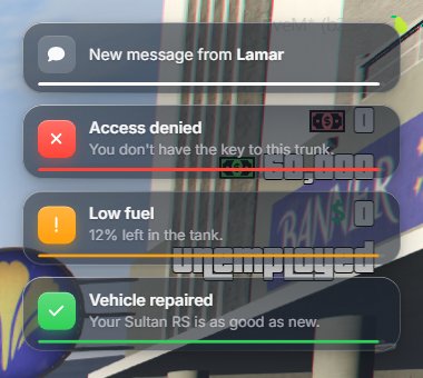
The icon sits in a colored tile and a thin bar shows the remaining time when showDuration is set. The style option still works, including ['.description'].
Text UI
Section titled “Text UI”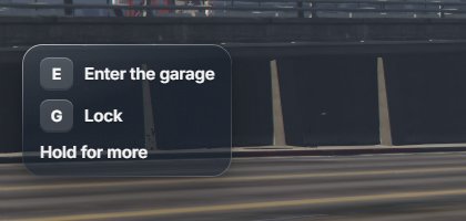
When the text starts with a key in brackets, like [E] - Open trunk, the key is drawn as a keycap. Each line becomes its own row. Any other text is shown as markdown, as before.
Progress
Section titled “Progress”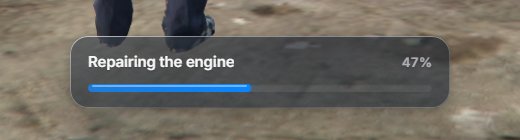
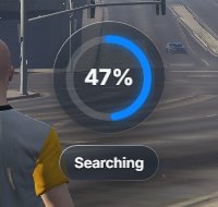
With setr ox:progressStyle "island", both the bar and the circle show up as a black pill at the top of the screen instead:

Context menu
Section titled “Context menu”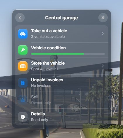
Descriptions, metadata, images, progress bars, arrows, disabled and read-only options, and the back button all work as before.
List menu
Section titled “List menu”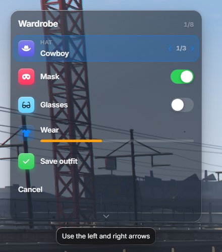
Checkboxes are drawn as switches. Keyboard controls don’t change.
Input dialog
Section titled “Input dialog”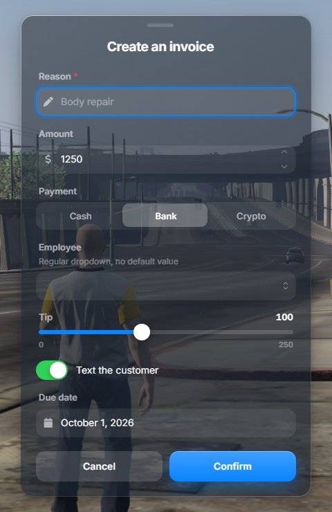
Every field type is supported and returns the same values in the same order.
Alert dialog
Section titled “Alert dialog”
Skill check
Section titled “Skill check”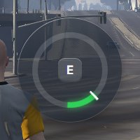
The target zone uses the success color.
Radial menu
Section titled “Radial menu”See Radial menu for the seven shapes.
For script authors
Section titled “For script authors”Nothing in your code has to change. These are the only differences you may notice:
| Option | With ox_lib Redesigned |
|---|---|
iconColor |
A saturated color fills the icon tile. White, grey, black or a transparent color gives a frosted tile instead, with the icon in the text color. |
Input checkbox |
Drawn as a switch. It still returns true or false. |
Input select |
With two or three short options and a default, it becomes a segmented control. It returns the same value. |
Dialog size |
xs to xl follow the interface scale. Other values, like '60%', are passed through as before. |
| Text UI | Text starting with [KEY] is split into one row per line, each with a keycap. |
Progress position |
Ignored when the server uses the island style, which always sits at the top. |
| Radial menu | The number of items per page depends on the shape. Clicks still report the same item index. |